A Rooted Brand Identity for SaaS Automation
- Client
- OCA
- Year
- 2024
- Country
- Brazil

- Type of Project
- Visual Identity

OCA Project
Behind every automated workflow is a business trying to grow without losing control of its operations, and OCA Digital exists to make that possible. The SaaS company transforms business management through automation and integrated technology. Its brand identity needed to carry an idea most tech companies never touch: that innovation can still feel rooted.
Industries
- SaaS
- B2C
The Challenge
The Challenge OCA Digital's work sits between two worlds: the precision of automation and the human reality of the businesses it serves. The brand identity had to express both at once. It needed to feel technical enough to earn trust as a SaaS company, and warm enough to feel like a partner rather than a system. Our core branding challenge was finding a single visual idea that could hold that balance, and make it recognizable.

From Product Strategy to Web Execution
- 1.
Immerse
Mapping the SaaS and automation landscape to identify the visual clichés OCA needed to escape.
- 2.
Plan
Translating the company name into a brand concept: the oca as a structure built to last.
- 3.
Create
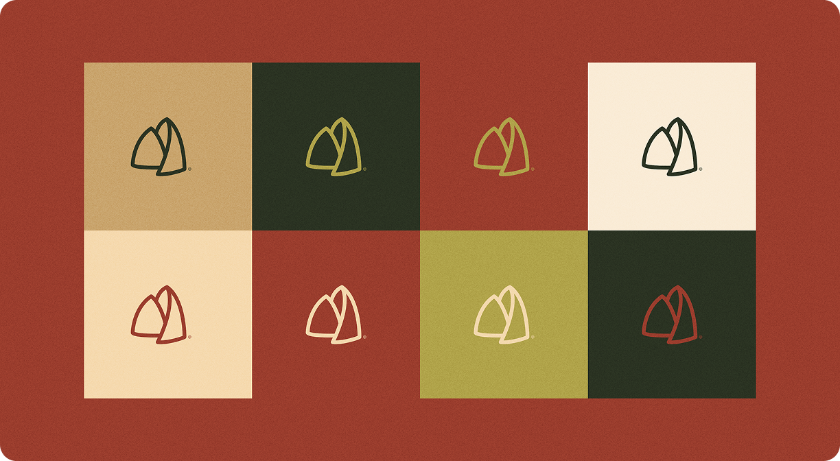
Designing the logo, earthy color palette, and typography system around organic, curved forms.
- 4.
Launch
Delivering a complete brand identity system, ready to position OCA Digital with clarity and consistency.
Solution
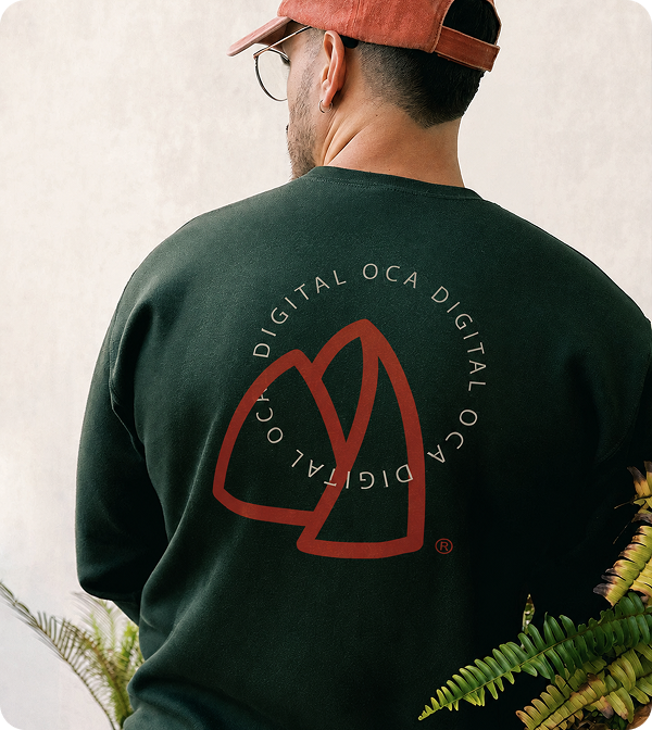
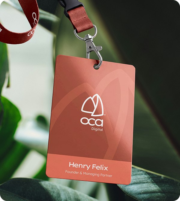
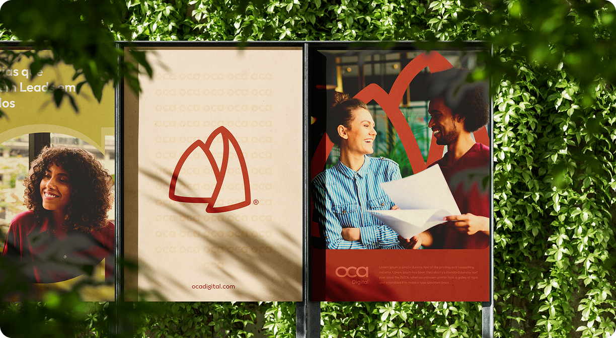
We took the name literally: an oca is a traditional dwelling, built from organic shapes and natural materials. That became the foundation of the mark, curved lines echoing those structures, paired with an earthy palette of greens and neutrals that reads as grounded rather than synthetic. Lexend Giga keeps the typography confident and current, so the brand still reads as a technology company, just not a cold one.

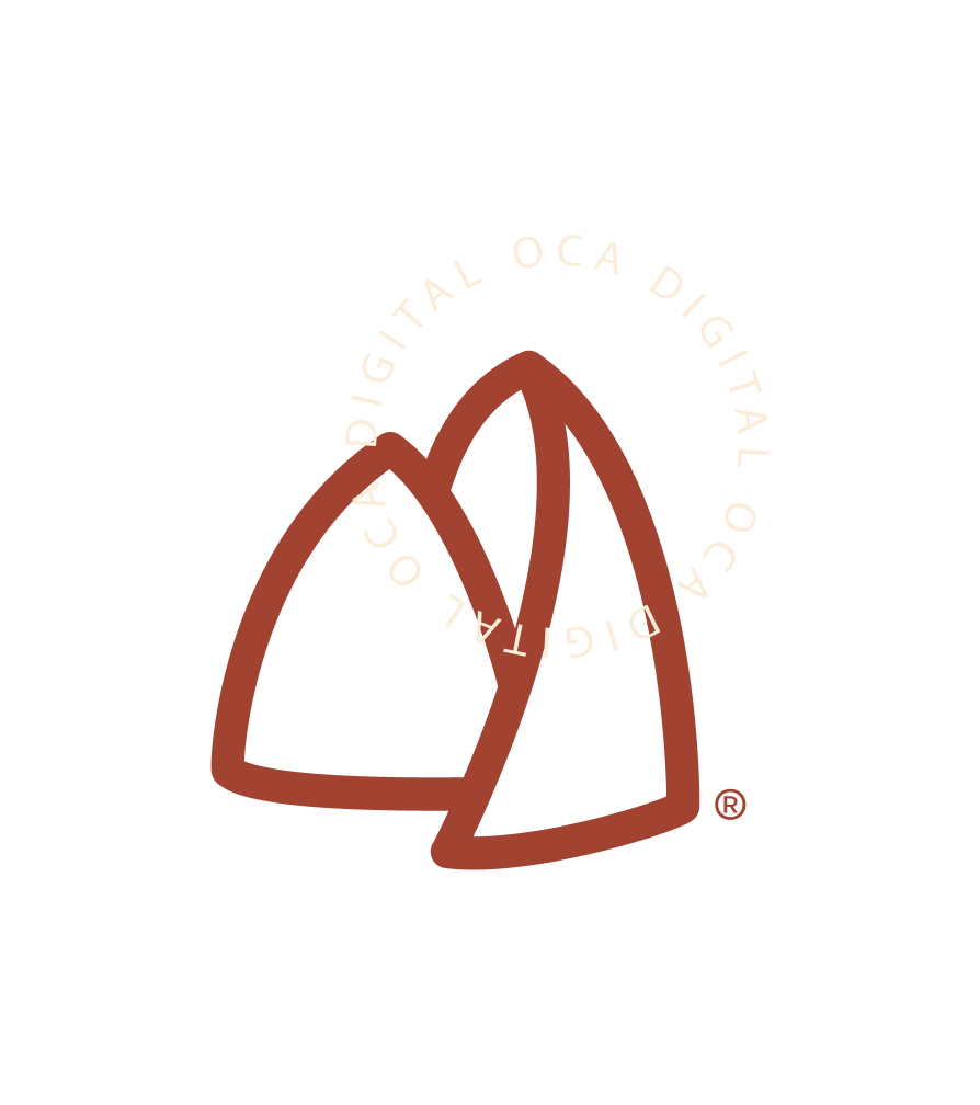


Effective solutions don't need to be complicated. In OCA Digital's logo, every line has a function, and that clarity is the design.