Travel Planning Web App UI/UX Design

Client
Tango
Year
2024
Country
USA
Type of Project
Web App
Abstract digital illustration made of hundreds of round dots on a deep teal background. The dots sit in rows that bend and ripple, like a grid pulled out of shape by a current. Most of the dots are a soft, semi-transparent teal. In the center, a dense cluster glows bright yellow, fading to amber and orange toward its edges. Glowing trails reach out from it to the sides and downward, and smaller warm patches are scattered near the bottom and left. The soft glow and blurred edges make it look like light spreading through a network.

Tango Project

Tango is a travel platform that shapes every itinerary around the experience someone is after: thrill, bonding, learning or immersion. We built a web app that makes that first decision as light as a swipe.

Industries

  • B2C
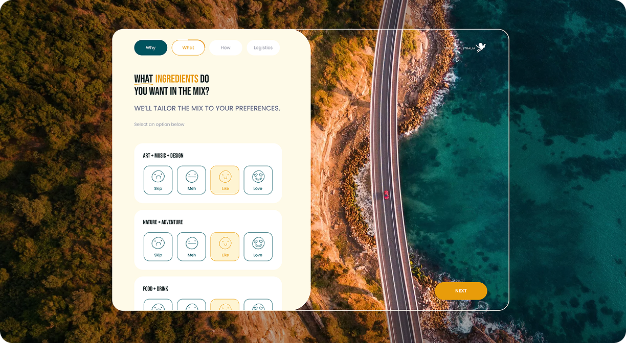
Widescreen web mockup of a personalized trip planner for Tourism Australia, shown with rounded corners. An aerial photo fills the background: a two-lane coastal road with a single red car, running between sunlit, forested cliffs and clear turquoise sea. A thin-outlined glass panel is laid over the scene, with the Tourism Australia logo in the top right and an orange “Next” button in the bottom right. On the left, a cream card shows the steps Why, What, How and Logistics, with “What” in progress. Below them are the headline “What ingredients do you want in the mix?”, with “ingredients” in orange, and the subtitle “We’ll tailor the mix to your preferences.” Three white cards list Art + Music + Design, Nature + Adventure and Food + Drink. Each card has four outlined face buttons (Skip, Meh, Like and Love), and “Like” is highlighted in yellow.

The Challenge

Travel preferences rarely begin with a place. They come from mood, purpose and the people coming along, and few of us can put that into words on a form. Our challenge was capturing that nuance in seconds, inside a product that partners would later run under their own name.
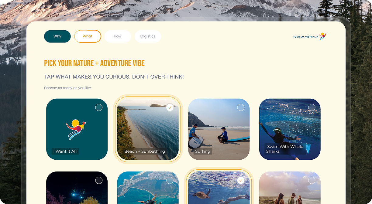
Desktop web mockup of a personalized trip planner for Tourism Australia. Snow-covered mountains and pine trees frame the edges of the background. A large cream panel holds the step tabs Why, What, How and Logistics, with “What” active, and the colorful kangaroo-and-sun Tourism Australia logo in the top right. The orange headline reads “Pick your Nature + Adventure vibe,” followed by “Tap what makes you curious. Don’t over-think!” and the hint “Choose as many as you like.” Below is a grid of rounded cards, each with a checkbox. The first row has a teal “I Want It All!” card with the kangaroo logo, an aerial shot of a palm-lined beach labeled “Beach + Sunbathing,” two surfers resting on the sand labeled “Surfing,” and a diver beside a spotted whale shark labeled “Swim With Whale Sharks.” The second row is partly cut off and shows a night dive with underwater lights, a tandem skydive over a coastline, a snorkeler swimming with a sea turtle, and a group walking through coastal dunes. The beach and sea turtle cards are selected, shown with yellow outlines and check marks.

From Product Strategy to UI Execution

  1. 1.

    Immerse

    Mapping how trips really get decided: by mood, purpose and company long before location.

  2. 2.

    Plan

    Turning four trip intents into a short sequence of choices that drives discovery and recommendations.

  3. 3.

    Create

    Designing swipeable mood cards, curated destination guides, a flexible itinerary builder and a theming layer for partner brands.

  4. 4.

    Launch

    Handing over one web app that ships as Tango or as any partner’s platform, with branding, content and structure fully adjustable.

Solution

Instead of a planning form, we designed a deck of swipeable cards. Each reaction to a mood or moment sharpens the recommendations, and the guides and itinerary builder pick up from there, so the plan grows out of what someone felt, not what they typed. Every screen sits on a white-label layer, letting partners reshape branding, content and structure without rebuilding the experience.
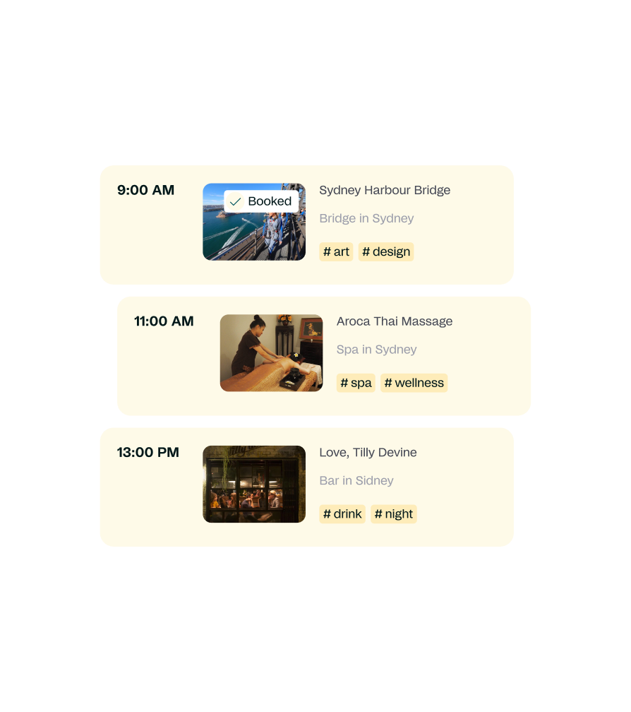
Detail of a Tourism Australia trip planner showing three staggered cream cards that make up a daily itinerary in Sydney. Each card has a time, a photo, the place name, its category and hashtag labels. At 9:00 AM is Sydney Harbour Bridge, “Bridge in Sydney,” tagged #art and #design, with a photo of climbers on the bridge above the harbor and a “Booked” badge with a check mark. At 11:00 AM is Aroca Thai Massage, “Spa in Sydney,” tagged #spa and #wellness, with a photo of a therapist giving a massage. At 1:00 PM is Love, Tilly Devine, “Bar in Sydney,” tagged #drink and #night, with a photo of a warmly lit bar seen through its front windows.
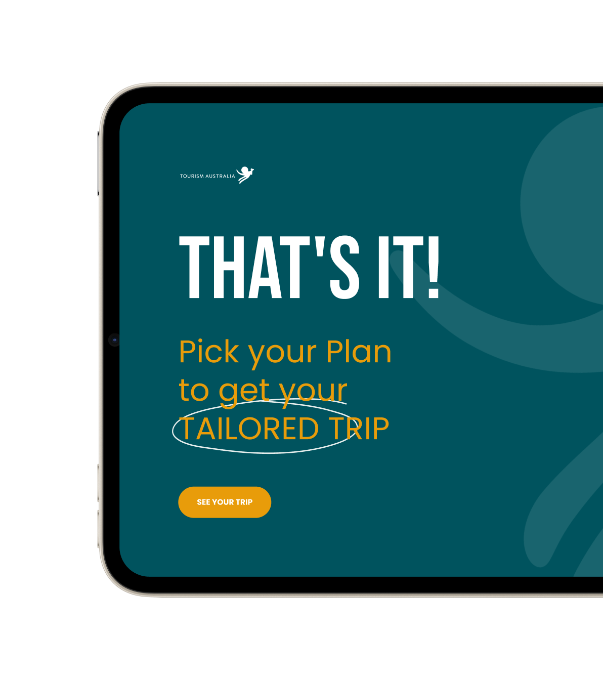
Close-up of a tablet in landscape orientation, cropped on the right, showing the closing screen of a personalized trip planner for Tourism Australia. The screen has a dark teal background with the white Tourism Australia logo in the top left and large, translucent curved shapes from the kangaroo symbol on the right. A tall, bold white headline reads “That’s it!” Below it, orange text says “Pick your Plan to get your tailored trip,” and a hand-drawn white oval circles the words “tailored trip.” Underneath is a rounded orange button labeled “See your trip.”
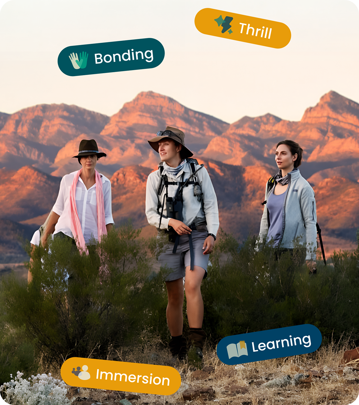
Three hikers walk through outback scrub with a rugged mountain range glowing red at sunset behind them. Tilted pill-shaped labels float over the photo, reading Bonding, Thrill, Learning and Immersion, each with a small icon.
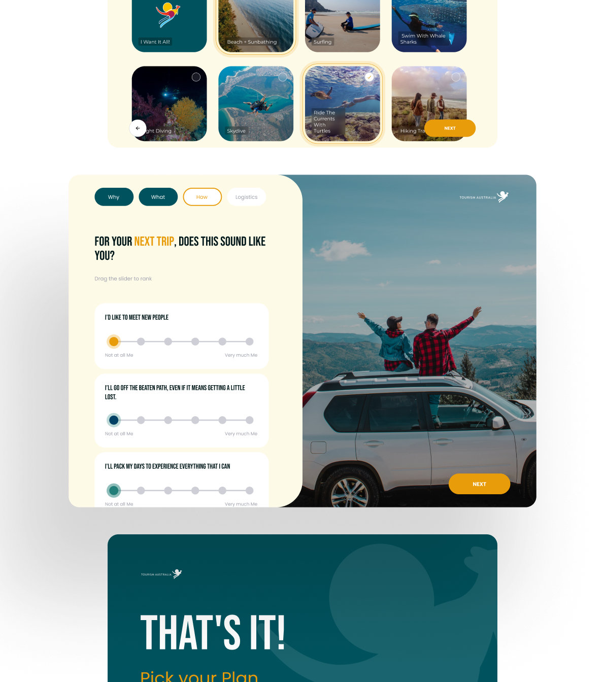
Three stacked screens from a Tourism Australia trip planner. The top screen shows the end of the activity grid, with a sea turtle snorkeling card selected. The middle screen asks “For your next trip, does this sound like you?” and has sliders for travel-style statements, next to a photo of a couple cheering on the roof of an SUV above a mountain valley. At the bottom, the closing screen reads “That’s it!”

A trip planner that starts with what you’re after, not where you’re headed.
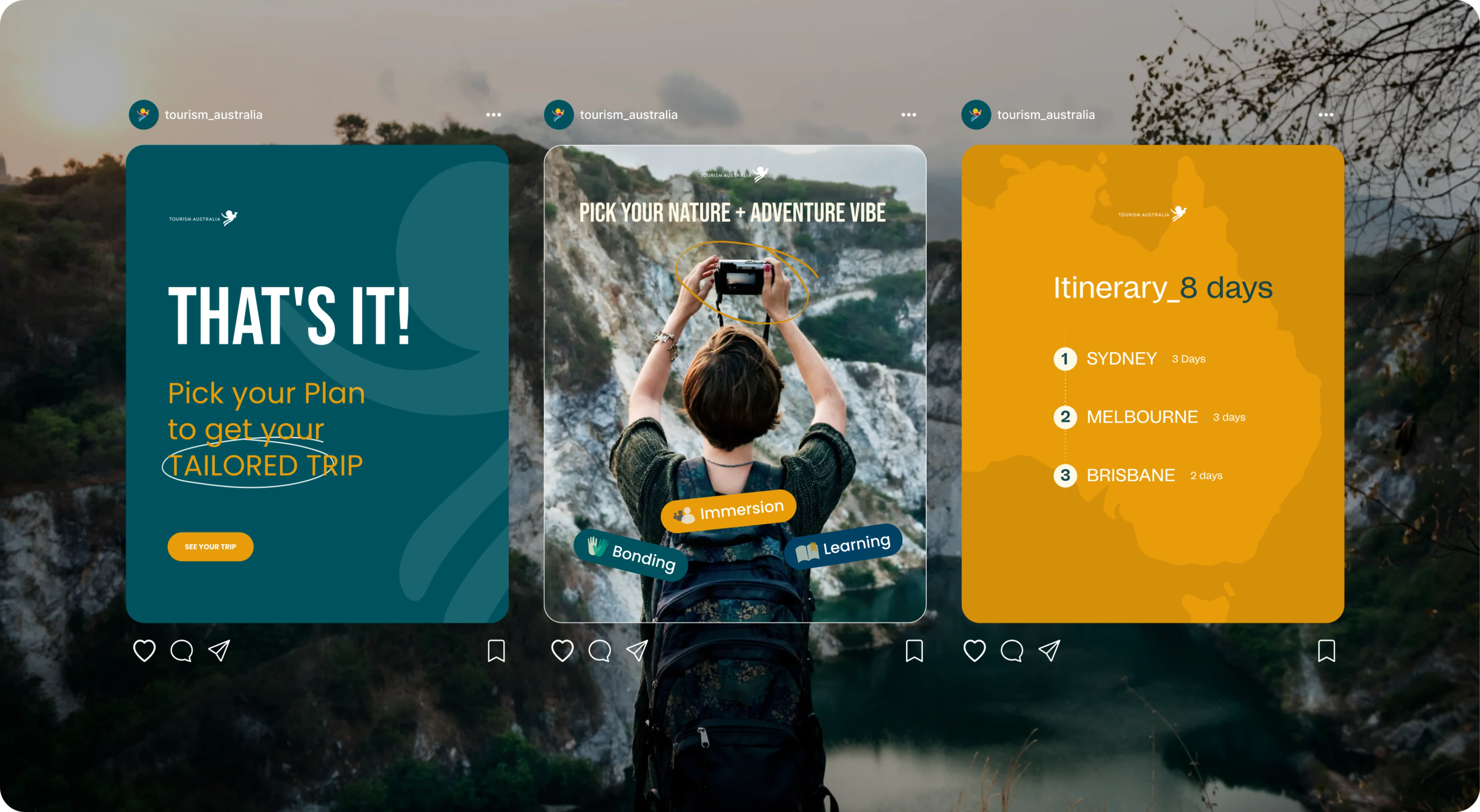
Social media campaign mockup with three Instagram posts side by side from the tourism_australia account. Each post has the profile header above it and the like, comment, share and save icons below it. Behind them is a blurred, hazy photo of forested limestone cliffs above a dark lake. The left post is dark teal, with a large white “That’s it!” headline, orange text reading “Pick your Plan to get your tailored trip” with “tailored trip” circled by hand, and an orange “See your trip” button. The middle post shows a woman from behind wearing a backpack, holding a camera above her head toward white rocky cliffs. Its headline reads “Pick your Nature + Adventure vibe,” the camera is circled in orange, and tilted labels read Immersion, Bonding and Learning. The right post is orange with a faint map of Australia and the title “Itinerary_8 days.” Below the title is a numbered route: 1, Sydney, 3 days; 2, Melbourne, 3 days; 3, Brisbane, 2 days.
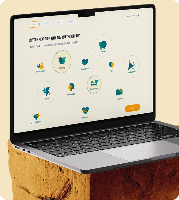
Laptop sitting on a block of red sandstone, showing the first step of a Tourism Australia trip planner. The screen asks “On your next trip, why are you travelling?” and shows scattered circular icons for motivations like Bonding, Escape, Thrill and Relaxation.
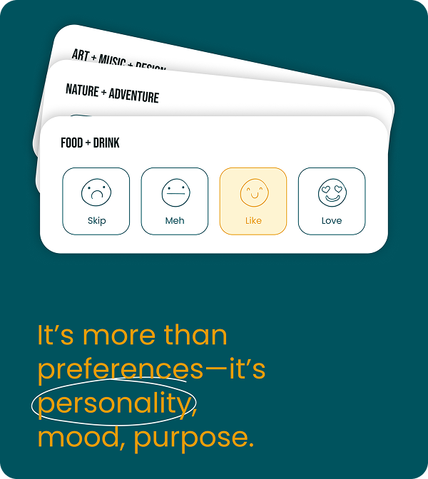
Design detail on a dark teal background. Three white preference cards from a Tourism Australia trip planner are fanned out like a hand of playing cards, labeled Art + Music + Design, Nature + Adventure and Food + Drink. The front card, Food + Drink, shows four outlined face buttons: a frown for Skip, a straight face for Meh, a smile for Like and heart eyes for Love. Like is highlighted in pale yellow. Below the cards, large orange text reads “It’s more than preferences—it’s personality, mood, purpose.” A hand-drawn white oval circles the word “personality.”
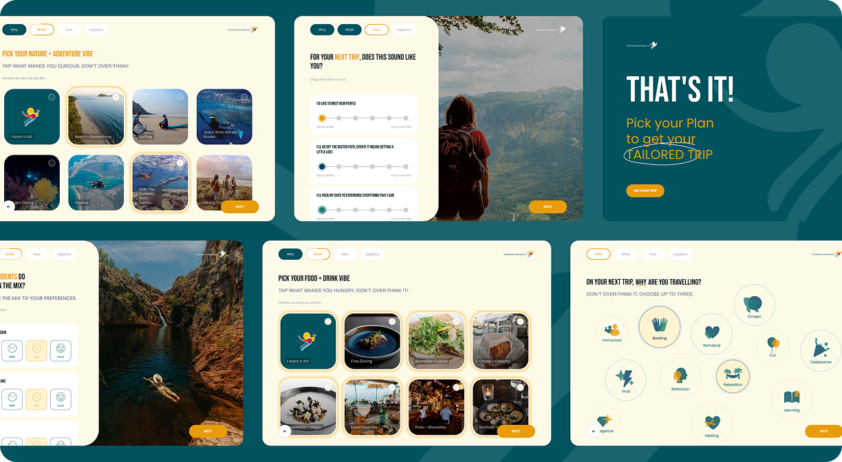
Overview of six screens from a Tourism Australia trip planner arranged in a grid on a dark teal background. They show each step of the flow: travel motivations, rating content categories, picking nature and food activities, ranking travel-style statements with sliders, and the closing “That’s it!” screen.
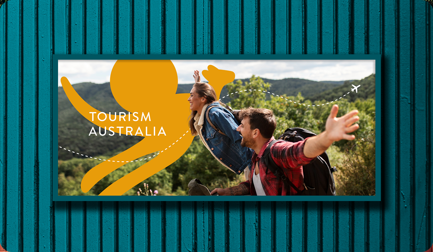
Outdoor billboard mockup in a dark teal frame, mounted on a wall of vertical teal corrugated panels. The photo shows a young couple with backpacks on a hike, smiling with their arms outstretched as if flying, against forested green hills and a cloudy sky. The woman wears a denim jacket with a shearling collar, and the man wears a red plaid flannel shirt. On the left, a large flat orange silhouette of the leaping kangaroo symbol overlaps the scene, with “Tourism Australia” in white capitals across it. A white dotted line loops across the image and ends in a small airplane icon in the top right corner.

More Work